The Hero Slideshow is a statement gallery, pop it into widget zone 1 and it will run as a full screen carousel which is the first thing your visitors see. Alternatively add it into your content (like on this page) or another widget zone and it will take scale to run at the available width of the container. You can add a title, description and button to each slide and the gallery adapts to mobile/tablet devices.
Creating the gallery
Go to "Modules" > "Galleries / Carousels", enter the name for the gallery and choose "Hero Slideshow & Dynamic Content".
The next step is to connect an existing folder of images to the gallery, or to create a new folder of images. Either way, click "Choose Gallery Folder" to launch the file browser, navigate to the pre-existing folder of images (or create one), then select any image in that folder and click "Insert".
Capitan will process all of the images in the folder then invite you to proceed to configure gallery settings.
Gallery configuration
Slides Tab
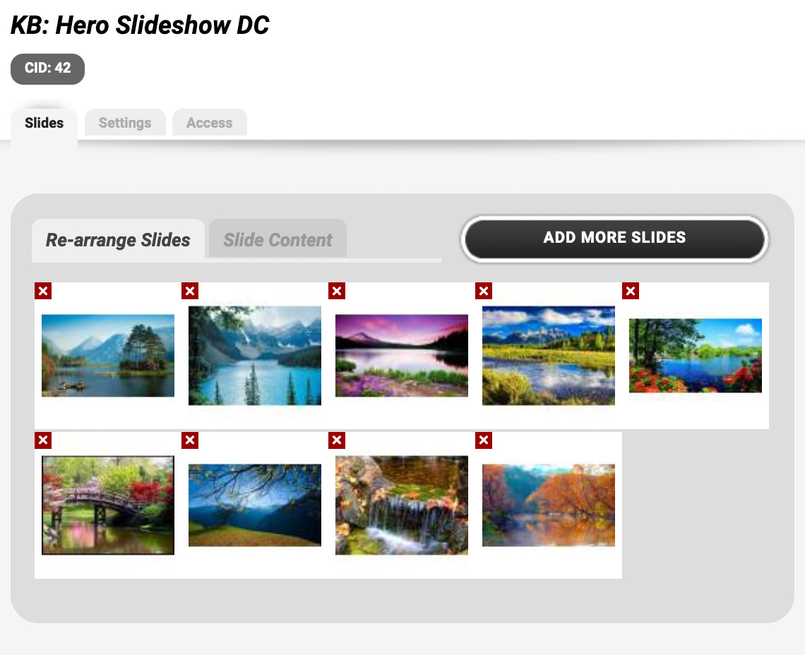
Here you can re-arrange the images (drag and drop) and definte the title/text/button settings for each slide.
Settings Tab
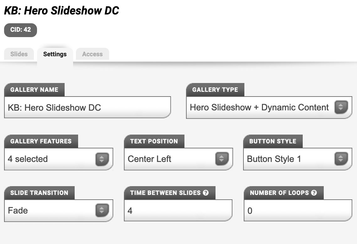
Here you can change the settings for the position of the text, it's size, and the style of the button. You can turn gallery features on or off, such as: darkmode, image filters, rounded corners, shadow, next/prev controls, etc. You can also define the number of seconds between each slide, and the number of slides to show and move for both desktop and mobile devices.
Access Tab
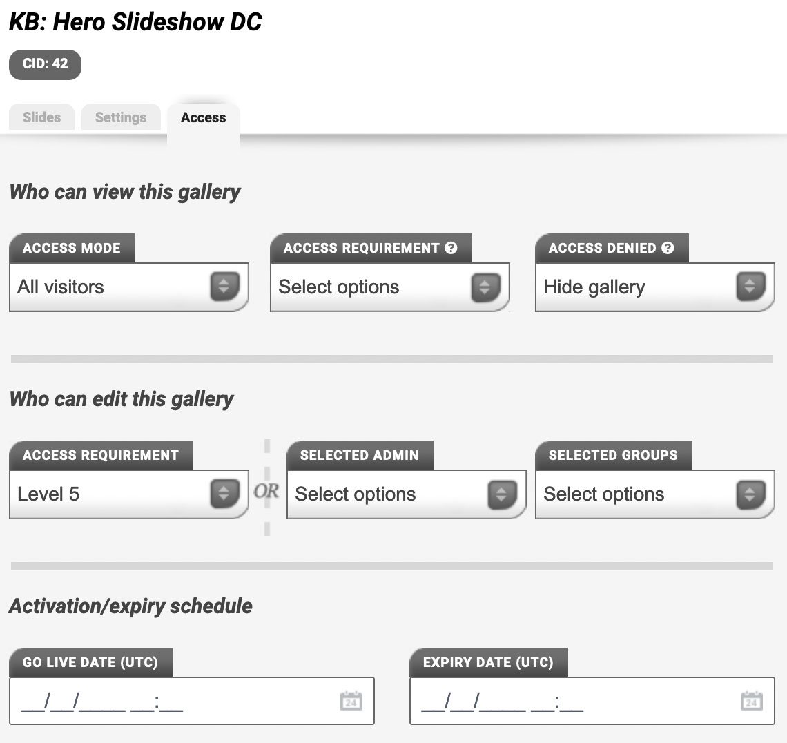
Here you'll find Capitan's standard access controls, allowing you to define who can view the gallery and who can edit. There's also an option to schedule the gallery activation and de-activation.
Alternative image formats for tablet/mobile devices
Capitan will automatically create square and portrait crops of your images for tablet/mobile devices. You can manually overwrite these via your File Manager to get your preferred image composition for each format.
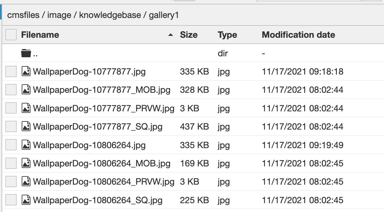
_SQ. suffix for square image
You'll find versions of all your gallery images with this suffix, ie: if you uploaded my-gallery-image.jpg you'll see my-gallery-image_SQ.jpg in the same folder.
The _SQ suffixed image will replace the standard image when the browser width is around the same as the browser height - somewhere between desktop and mobile, which is usually occupied by tablets.
_MOB. suffix for portrait image
You'll find versions of all your gallery images with this suffix, ie: if you uploaded my-gallery-image.jpg you'll see my-gallery-image_MOB.jpg in the same folder.
The _MOB suffixed image will replace the standard image when the browser becomes portrait in format.
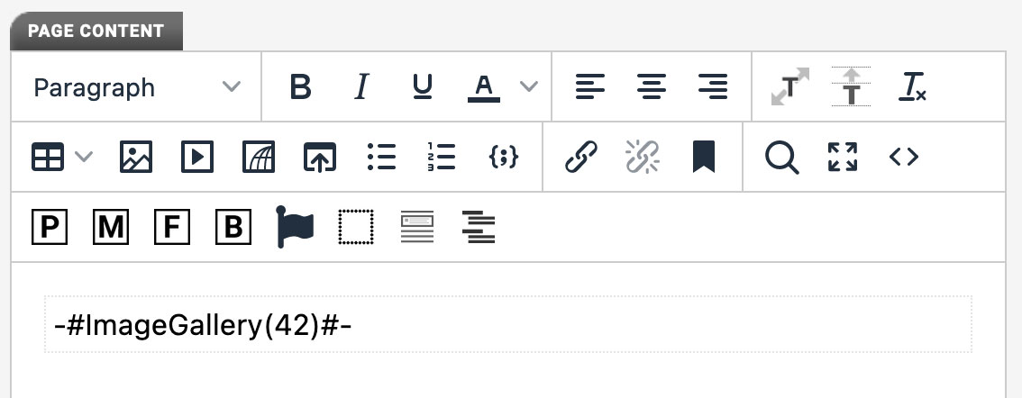
Add the gallery to a page, widget or module item
Simply click the "M" button, choose "Gallery", then select the gallery from the dropdown menu and click OK.
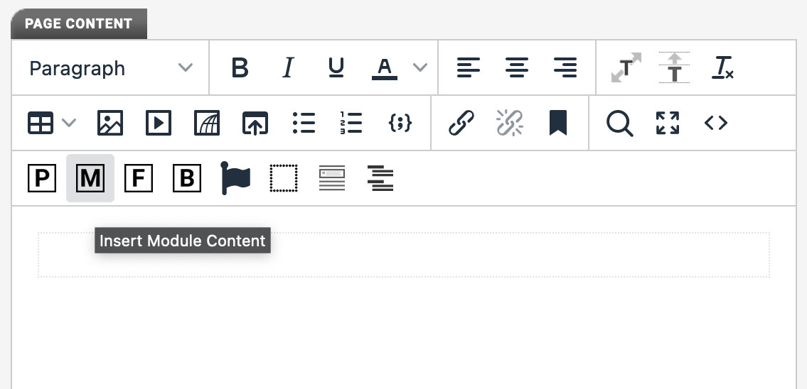
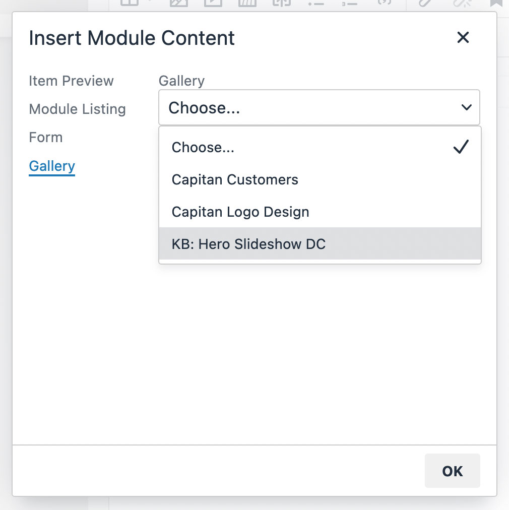
This will insert a piece of "MagiaCode" into the content window which will be converted to a working gallery when the page or module item or widget is viewed on your website.
